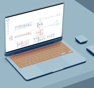
Introducing ReGraph
Join us on this quick tour of ReGraph’s React network visualization API. We’ll show you how ReGraph works, how easy it is to get started and why it’s the best data visualization option for React projects.
ReGraph Webinar Transcript
Prefer a written version? We’ve transcribed the webinar for you
Good morning, everybody. Thank you for joining the webinar. This is a very exciting webinar today because we’re introducing a brand new product from Cambridge Intelligence called ReGraph.
Now ReGraph is a toolkit for building interactive React graph visualization applications. Now, that’s a little bit of a mouthful. So we’re going to basically take the rest of the webinar to explain to you what that means and what ReGraph does and how it’s helpful for you.


To start off, I’ll introduce myself (pictured left) and Kevin (pictured far left). So my name is Corey Lanum. I’ve been with Cambridge Intelligence for six years now, but been doing data visualization for 19 years, mostly for industry and for governments around the world. And I’ve also written a book about graph visualization that you can check out if you want, it’s called Visualizing Graph Data.
About halfway through, I’ll be handing off to Kevin. Kevin is our product manager. And he’s the one who is responsible for setting the overall direction of our products, both KeyLines and ReGraph, and also deciding which features we build and when those get released into our products.
So this is what we’re going to talk about today. We’re going to go through:
- why it makes sense to visualize graphs (that may be review for many of you but we’ll spend a couple of minutes on it just to explain)
- we’ll be talking about what ReGraph is and how it’s been built and what it can do for you
- And then Kevin will spend a little bit of time in more detail with the graph API to talk about some of the technical detail as well
- And we have some time at the end for questions
Want to know more about ReGraph?
Why visualize networks?
So the first topic I wanted to go through is why is network visualization even helpful. And it’s really the case that network visualization is most useful when you have relationships among your data elements, and those relationships convey some interesting meaning.
So if you just have a list of items, for example, with a list of properties, your standard relational database table that doesn’t have any connections between those data elements, say a list of products for sale in your store and the prices of those, then graph visualization is not the most helpful way of looking at that data. But when you have connections, for example, here, we’re looking at internal emails within an organization, and each person emails another person. And so each person can appear in the table multiple times.

The result is that the email can be modeled as a relationship between those individuals. And then you can start to uncover some really interesting things about that pattern of relationships that you may not have uncovered by looking at it in a standard tabular form.
So over here, on the left, for example, we have the sender, the recipient, we have the date/time that the email was sent, and the subject line and probably other fields like the actual text of the email itself. However, if I’m not interested in looking at the text of the email or reading them, but I’m interested in the pattern, who in my company is emailing whom else? When are those emails happening? Who is acting as gatekeepers of that information, or who is the most influential across the network? Those are the kinds of things where a graph model of the data and visualizing that graph can really expose a lot of interesting insight that you wouldn’t get otherwise.

So the key to network visualization is when there are relationships in the data and you want to visualize and model those relationships in a way that you can uncover them and learn interesting things about them.
So graphs and data visualization are really being used across a wide variety of different use cases in both industry and in government. So these are just a few of them that we’ve come across in our product set. So defence and intelligence are really some of the early adopters of network visualization, for example, looking at terrorist networks and how they might be connected to one another, or intercepting communications.
In the law enforcement world, looking at criminal organizations and gangs and things like that has benefited from network visualization. Anti-fraud is a really popular use case as well because it involves looking at transactions and fraud is an artificial or manufactured transaction. Being able to recognize that among the pattern of all of the normal transactions over the course of business that could be in, say, insurance fraud or banking fraud, or stolen credit cards, for example, things like that.
Cyber security, the transmission of IP packets, infected packets, the transmission of other malware across a computer network is also something that lends itself very well to network visualization, as also just looking at the actual devices on our network itself. So where are my switches, my routers, my hosts, my servers and things like that, how are they all connected to one another. And I’m sure that there are many, many more applications of network visualization that I was not able to list here. But these are some of the top ones that we see our customers using.
How do you create a network visualization?
So when you’re presented with a graph problem, and you want to solve that sort of problem, there are a few different avenues that you can take to create a network visualization.
1. Build your own solution
Now, one is to build something completely from scratch. So taking care of building it into your application, taking care of the rendering, working with the canvas elements in HTML5, presenting that as part of a web-based application. And if you have very, very specific requirements, that may be something that you want to tackle, especially if you have a background in graphics, and especially in web graphics.
2. Use an off-the-shelf application
And then the other avenue is to use a pre-built application. So if you are trying to solve a graph problem where you’re going to be loading data into an engine, taking a look at the results, publishing those results, and then throwing the engine away, then a prebuilt application may make a lot of sense.
3. Work with a toolkit (our favorite choice)
The middle ground is what we produce as a toolkit. The reason that’s a middle ground is because it enables you to build a network visualization capability into an existing web application or into a new web application, present that as part of your application, and customize all of that user experience. So it doesn’t require you to have that detailed graphics knowledge from building something from scratch, but your users who are working with the graphs and data visualization can do so in your environment and in your application with your parameters set, as opposed to having to exit to a third-party tool. So that’s why we think that a toolkit can be in many circumstances, the best approach here.
[For a more detailed comparison of these options, see our blog post on Open source network visualization]
JavaScript or React network visualization?
KeyLines is a product that we have had for many years now, and is a toolkit for building web applications using JavaScript.

ReGraph is a toolkit for building React network visualization, which ultimately is JavaScript, but because it is a layer that sits on top of JavaScript, many React developers don’t think in the same way as developers who are writing applications using native JavaScript. The differences between the two are pretty significant in the way that they interact with data sources and in the way that different components can interact with one another.
We’ve introduced a React network visualization toolkit that allows for developers to build things on top of React much more quickly than they would if they were writing native JavaScript. So the information over there on the right really applies to both products, both our KeyLines product and our ReGraph product, that it allows you to completely customize that user experience in terms of what data you’re presenting, how the users access that data, how the data is shown on the screen, how it’s modelled and things like that.
With both products, you get full access to our support and our teams who are able to provide support on both React and native JavaScript.
Now I’m going to show you a couple of examples from our ReGraph API of what sorts of things you can do with ReGraph. And then I’ll hand it off to Kevin, who’s going to go into a little bit more detail about how those are built.
React network visualization & social network analysis
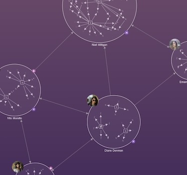
The first one I’m going to start with here is one that you may have seen with KeyLines. It’s the same data but built slightly differently. We’re looking at internal emails within an organization. In this case, it happens to be the corpus of emails that was published as a result of the Enron investigation. So what we see when we model that as graph, as I mentioned at the beginning, the individuals are nodes, the links between those individuals are the fact that those two people have emailed one another in our dataset.
So with ReGraph, what we’ve done is we’ve just created that underlying dataset in the state of the product. And then ReGraph has taken that and modeled it as a graph automatically and showing it to you and created this interactive environment where I can scroll around and explore through it. One of the important things in ReGraph is that you want to take visual properties of these nodes and links that you’re showing to your users, and model those properties back in your underlying data source. So right now what we’re looking at is a graph where everybody looks the same, the nodes are the same blue light blue circles, the links are the same links. And we’re not conveying any other interesting information from our underlying data source. But that’s really the power of our React data visualization for graphs – it’s when you can show the user the properties of those items that they expect to see without them having to drill down.

I’m going to take the width of the link and bind that to the number of communications between these individuals. Everything in ReGraph is animated so we actually got to watch those links grow. So for example, here we have Cynthia Mann, who is emailing Sheila Tweed quite a bit, but receiving very little back in the opposite direction. And that’s interesting information that you wouldn’t have learned either by looking at this as a table or in its native format, where everything was represented with the same links.
So there, we were using properties of the links to show something interesting about the underlying data, but we can also use properties of the nodes themselves. So for example, I may want to size the nodes according to their influence throughout the network – the number of connections, that this person has, the number of emails that they’re sending out.
I can see, for example, that Tanya Jones is the largest node on the chart, and therefore, she is the one who is sending out the largest amount of email. We can see that by selecting her and selecting the links, which is the emails and the people that she’s communicating with.
ReGraph combos for decluttering your React network visualization
One of the most common scenarios with network visualization, though, is that you end up putting too much data on the chart. In this example, it’s not too bad, we’re looking at maybe about 100 nodes. But many underlying data sources have thousands, tens of thousands, even up to the millions of nodes. And it oftentimes doesn’t make sense to try to throw that all on the screen for the user to parse out at the same time.
So in ReGraph, we have a large number of features, which were designed to help reduce the amount of clutter and allow the user to still parse through the data and make sense of it and understand what it is that they’re looking at. So as an example of that here, we can create groupings. We call these combinations [combos]. But what they are is a way of organizing subsets of nodes and representing those nodes on the chart with a node itself, but allowing you to see the detail that’s behind that node and the individuals that are inside of it.

So in this case that we’ve gone beyond Enron here (this is actually fabricated because we don’t know the management structure of Enron) but we made something up to show it. We’ve grouped at two different levels. So we’ve had the various entities within Enron, so Enron the international subsidiary of ventures component, and so on, and put people in the subsidiaries that they are employed by. But then within each one, there are also teams or departments that these people work in. So inside of each group, we have subgroups, which represent those teams.
So I can see Tanya Jones, who we looked at earlier, is part of Enron corporate communicating mostly within her own subsidiary within the management team, but also to other teams within her subsidiary, but then also to a few other individuals outside of that in other groups. So while we were previously looking at 100 different unrelated nodes, by using the grouping feature, which is really powerful, we can allow end users to really look at only the areas that are of interest to them, but still see the context of everything else on the chart.
Experiment with ReGraph
A React network visualization based on Twitter
I’m going to look at a slightly different dataset here. So in this example, we’ve taken the graph and we’ve bound it to the GraphQL engine for Twitter. We can submit graph queries up to Twitter and get those results back. So we built a little mini application around that just to show how it works, and how you might do something similar in your application.

So in this case, we can search for any hashtag that appears across Twitter. So I’m going to search for Lowell. I’m sitting here in Lowell, Massachusetts. And we see basically a graph that represents the individual tweeters who are tweeting with #lowell. So I can see who’s doing that. I’ve modelled that as a graph. So the tweeters themselves are nodes. The hashtags themselves are nodes and the tweets are sitting in between the two other two nodes.
I can actually read the text of the tweet here. So for example, it seems that there was a professional wrestling match here in Lowell a few days ago. So most people who are tweeting with the hashtag ‘lowell’ are referencing that right match. But one of the powerful things that I talked about earlier – reducing clutter – we’re not going to bring all of Twitter into the visualization, all at the same time.
[For details on how we built this demo, see The big data challenge: visualizing Twitter with ReGraph & GraphQL]
Expanding data through queries
So what we’ve done here is we’ve created that interactive experience where the user can do what’s called expand, or go off, issue a new query against the Twitter API, and bring that information back into ReGraph.
So for example, I think this just judging by the picture happens to be a professional wrestler. So if I double-click on him, I can expand out and see what other hashtags he happens to be using. And “Mass Hysteria” I believe was the name of the event here in Massachusetts, I can then expand on that and see who else has been talking about that specific event. We’ve also created a pane on the left here that goes through that individual’s tweets, depending on who I have selected. So I can then use other information on the same page as my ReGraph component, to be able to expose additional information about that individual node, in this case, an individual Tweeter, and what they’ve actually produced.

So this kind of expand feature is a really interesting way of allowing the user to start with some sort of query. In this case, I started with #lowell, I then used the information that came back from that, parsed it out as a graph, passed it to ReGraph, and allow the user to expand out from there to ask for additional information about some of the items that they see on the screen at first, and then continue expanding the graph from there. So they get the exact graph that they’re interested in looking at, and they get the interesting information that they want to see as a result.
So with that, I’ll pass it on to Kevin, who is going to dive into the graph API and talk about that in more detail.
Why we created a React network visualization SDK
Thanks, Corey. So as you can see, there is some great data visualization potential for ReGraph. But you might be wondering exactly why it’s important that this is a toolkit for React.

So React is a very popular JavaScript library, specifically for creating user interfaces. And as Corey hinted at, all of the updates are managed by a state object that is handed around to the various UI components in your React network visualization application. And so ReGraph is built to receive this object full of connected data through the state, and then to figure out what has changed or what it needs to do to render that data beautifully on the screen for your users.
So why use ReGraph with React? Well, it is as close as you’re going to get to a native React experience when you are doing network visualization.
We’ve had a lot of feedback from React developers that it works exactly the way that they would expect a React network visualization component to work:
- There is minimal product-specific API learning required – you specify things as you would for any other React component.
- The API uses very natural language to determine the various properties on items.
- ReGraph also takes care of animations and layouts so that you can focus on creating a great experience for your customer.
So with that, I am going to dive into some code. When you first arrive on the ReGraph SDK site, you will have access to all sorts of things, including over 50 different code examples. So we’re going to check out some of those now.
We’ll start with this very simple welcome demo. You might notice if you’re unfamiliar with React that the code looks like a weird mashup between JavaScript and HTML. This is JSX and it is a key part of ReGraph and will be very familiar to any React developers.
Getting a chart into your React application is very easy. You import a chart component from ReGraph and then you tell React that you want a chart. You pass your object of connected data, then ReGraph will generate that chart for you.
[For more details, see Getting started with ReGraph, our React toolkit]
How the React state model works
Changing your data in the world of ReGraph is really easy. You can add an item, simply by adding it to the list of items that you’re passing to ReGraph. ReGraph will handle all of the animation and the layout as you add items. And similarly, if you want to remove items from your chart, ReGraph does a really nice job of animating that as well.
And so this is a very simple example of how you can simply change your data, and ReGraph will handle the rest. And it’s not just nodes and links that you can pass in as part of your state. You can also pass in combos, as you saw in Corey’s first demonstration.

Now, some of you might be familiar with combos and KeyLines. We’ve done a lot of work to overhaul the API, where combos are concerned so that they are very easy to use in ReGraph. You define your categories that you want to combine nodes by – so in this case, we’ve got a group and a subgroup – and then you tell ReGraph, how many levels deep you want to combine, and it handles the rest. So with those two lines there, and a property on each node, you very quickly get to a combo that has your groups and subgroups.
As part of your state, you can also pass some layout information. If we start with a very simple chart, we might decide that we want to view this data in a hierarchy. As we add more data, ReGraph is going to maintain that layout, and nicely keeps the hierarchy view as more data is added.
There are other things that you can pass in as part of your state as well, for example, you can pass in positions and you can adjust how long the animation takes. There are lots of other pieces that you can look at, in the reference documents for the whole details on your state.
Creating time-based React network visualizations
Now, the chart is not the only component that you get as part of ReGraph, you also get a time bar. And the time bar is just as easy to import as the chart. You import it right beside the chart, you specify it in a very similar way, and when you use the time bar, you can very quickly and easily filter your data down. So perhaps we want to look just at November here. Here’s one week in November. And as we move along, we can see our data is seamlessly updated.
Resources available on the ReGraph SDK site

In addition to the 50+ code examples, there is also some extensive documentation with live examples built in where you can see the time bar and play with charts.
There is also a full API reference, which additionally comes with TypeScript support for those of you who are developing using TypeScript. And it is also very easy to get started with ReGraph. You very simply download a copy, creating a new React app and getting your first graph visualization up and running. The instructions are there – it’s fewer than 10 steps to very quickly get going with ReGraph and graph visualization.
[We’ve since added an interactive code editor and live chart to ReGraph. See Serious playtime with the ReGraph playground]
Q&A session
Does ReGraph works with Neo4j?
Yes – ReGraph is designed to be independent of any specific graph data source itself, so it can connect to any graph database, including Neo4j. And the example that I showed you earlier, where we were using GraphQL to connect to a Twitter endpoint would be very similar to how it would work with Neo4j, where we would use Cypher to connect to a Cypher endpoint, and that would pass the data back to your graph. You would then update the state object and have the information that was in your database represented in your graph, and be very straightforward.
[For details on how to integrate ReGraph and Neo4j, see our tutorial on GR-R-ANDstack (the 2nd ‘R’ stands for ReGraph)]
When would I choose to use ReGraph over KeyLines?
KeyLines is for JavaScript developers or people who are using a different framework like Angular or view, whereas ReGraph is built exclusively for people who are using React. It’s not helpful for anybody who’s not doing that, because it has a dependency on that React framework.
Which performs better: KeyLines or ReGraph?
Performance quality is the same. So underlying both technologies is a graphics engine that actually puts the nodes and edges on the screen, allows for the animation, and things like that. So the amount of data that you can present, and the equivalent frame rates that you get when you’re animating large volumes of nodes and links is pretty much identical between KeyLines and ReGraph. So performance wouldn’t really be one reason to choose one tool over the other.
Are the core components between KeyLines and ReGraph the same?
The engine is the same, so the actual graphics piece that’s doing the rendering on the screen is shared between the two products. But that’s about it. From the engine up, they were built separately to take advantage of the strengths of React and other frameworks, or just native vanilla JavaScript.
Do you have graph algorithms in the tool?
The answer is yes. So just like with KeyLines, it can run graph algorithms to determine closeness, betweenness – some of those things I showed in the Enron example. So looking at the shortest path between two nodes, looking at the number of links originating from nodes, finding out who the neighbors are of specific items, and things like that. Just like within KeyLines, those are in ReGraph as well.
Which of these two toolkits does the team improve first?
They’re independent streams. They’re relying on the same engine, so an improvement to the engine would automatically affect both products. Other than that there are different development streams: we may add features to one or the other, depending on where they’re the most relevant.
I think that’s all the questions we’ve got. So thank you very much for joining the webinar. If any other questions arise afterwards, feel free to reach out to us directly, and we’ll be happy to to address them.
Have a great day!